


November 4, 2026 Showing Its Work: Heatmaps, Saliency Maps, and the Visual Grammar of Explainable AI on the Dental Radiograph
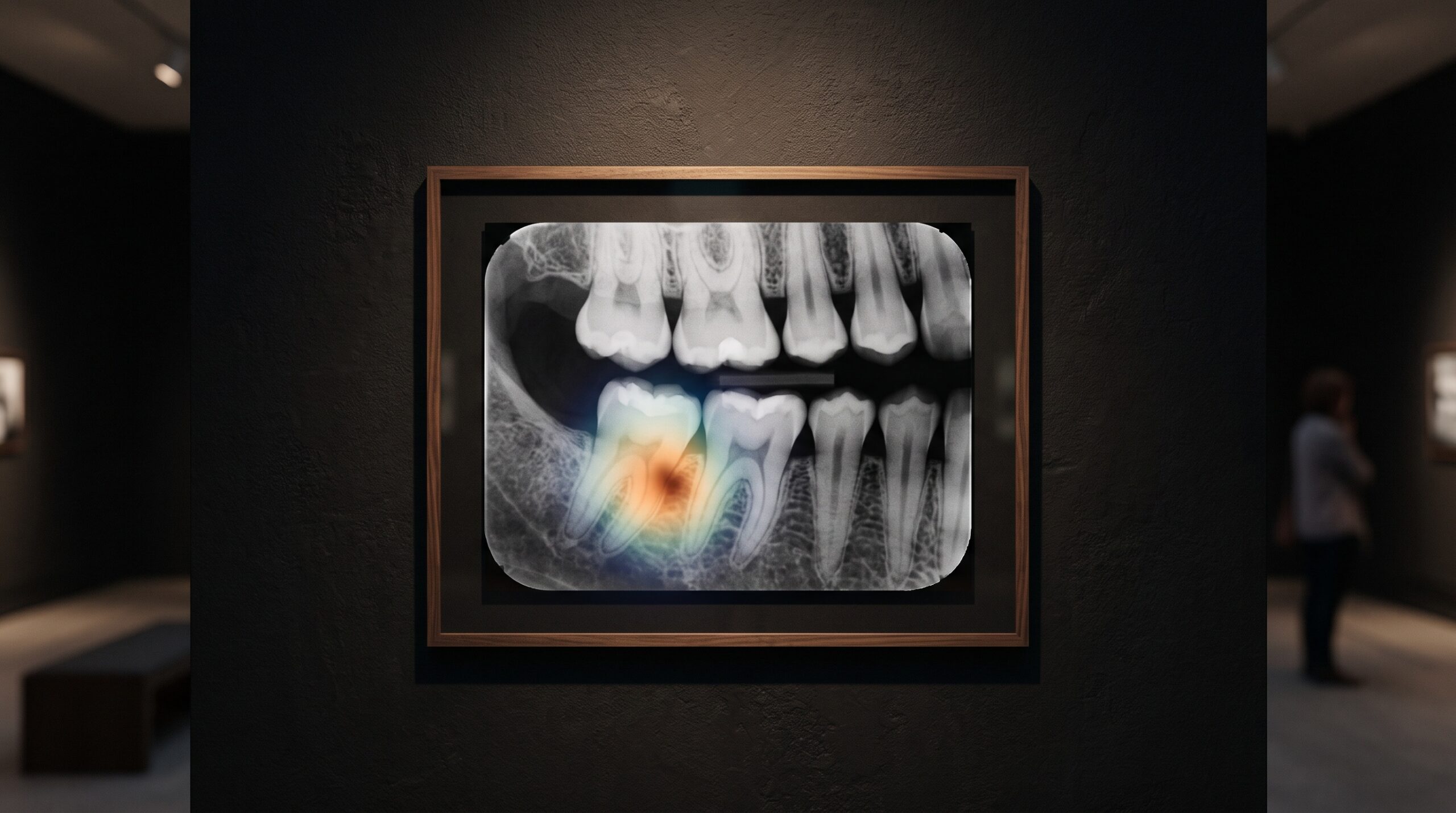
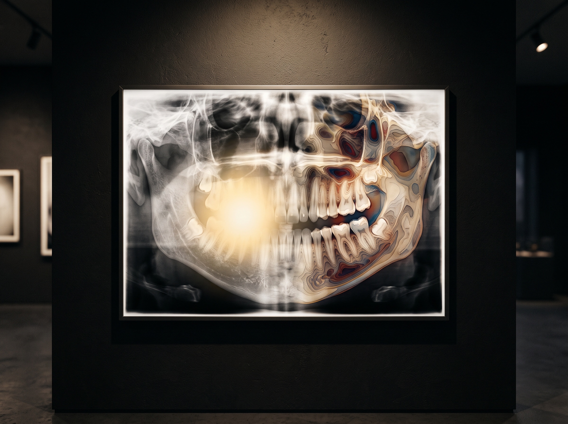
An artificial-intelligence reader looks at a bitewing, pauses on a shadow at the distal of a lower molar, and returns a verdict: likely caries. On the older systems the verdict arrived bare, a box and a probability, a judgment with no account of itself. On the newest ones something else appears first. A warm wash of color blooms over the radiograph, brightest at the very shadow the machine fixed on, cooling to nothing across the rest of the frame. That wash is called a saliency map, or a heatmap, and it is the model’s attempt to show its work. It is also, for a gallery that treats the radiograph as a made image, a new kind of picture entirely, one painted not by light and tissue but by the machine’s own attention, and like every picture it rewards a trained eye and punishes a credulous one.
What the Colors Are Actually Made Of
A heatmap is not a second opinion drawn freehand. It is computed from the network’s own internals. The most common method, gradient-weighted class activation mapping, asks a precise question of the trained model: for the finding it just declared, which regions of the image, if nudged, would most change that declaration? It answers by tracing the gradients flowing back from the decision into the last convolutional layer, weighting each feature map by how much it pushed the verdict, and collapsing the result into a single coarse grid of importance. That grid is then upsampled and tinted, hot where influence was high, dark where it was negligible, and laid over the original radiograph. The foundational technique is a decade old now, but its descendants are what paint nearly every explanatory overlay a dentist sees today. Understanding that lineage matters, because it tells you exactly what the color does and does not mean: it is a map of influence on the output, not a map of disease.
Influence Is Not Diagnosis
This is the distinction the whole craft of reading a heatmap turns on. A bright region tells you the pixels there mattered to the model’s answer. It does not tell you that those pixels contain a lesion, nor that the model’s reasoning about them was sound. A network can arrive at the right answer by attending to the wrong thing, lighting up a restoration margin while the actual decision rode on a texture cue elsewhere, and it can arrive at a wrong answer with a heatmap that looks perfectly reasonable. The overlay is a window onto correlation inside the model, not a proof of clinical cause. We have written before about the limits that surface when AI is pressed to account for itself, in the hard-won lesson of what a general chatbot cannot see in a radiograph, and the heatmap is the specialist’s version of the same humility: a tool that reveals where the machine looked without promising that looking was understanding.
The Seduction of a Convincing Overlay
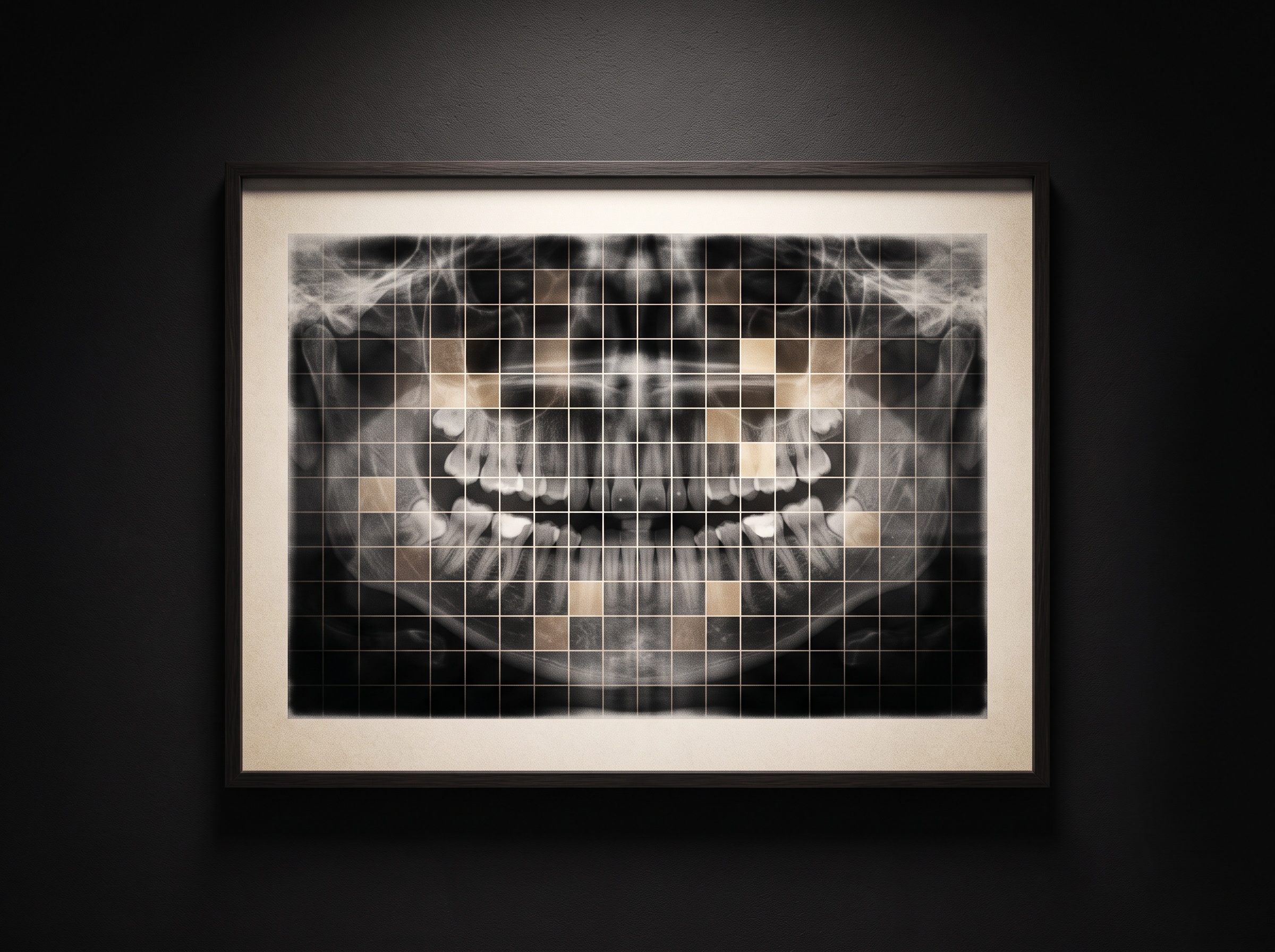
There is an aesthetic danger here that this gallery is unusually alert to, because we have seen it in other guises. A heatmap is persuasive precisely because it is beautiful and precise-looking. A tight, confident hot spot sitting exactly where the clinician already suspected a problem produces a small jolt of agreement, and agreement feels like evidence. But a plausible explanation is not a correct one, and the research literature is full of saliency maps that are convincing and wrong, or that barely change when the underlying model is deliberately broken. The same way a sharpening filter or an aggressive contrast curve can make a radiograph look more diagnostic than it is, a well-rendered overlay can make a model look more trustworthy than it is. The discipline is to let the heatmap raise a question rather than settle one, to treat the glowing region as an invitation to look harder at that part of the real image, not as a second signature confirming the first.
Reading the Overlay as an Image
Because the heatmap is a picture, it can be read with the same visual literacy we bring to any other. Its shape is diagnostic of the model’s behavior. A single crisp focus that lands on anatomy consistent with the finding is the reassuring case, worth a closer look at the native grayscale beneath it. A diffuse smear across half the arch suggests the model is leaning on broad context rather than a discrete feature, which is not wrong but is weaker ground. A hot spot anchored on a cone-cut edge, a sensor artifact, or a patient-name burn-in is a red flag that the network has learned a shortcut, keying on something incidental to the capture rather than the biology. This is why the overlay should never be read in isolation from the raw radiograph, and why the ordinary craft of manipulating the real image, the patient adjusting window and level to read a radiograph the many ways it can be read, remains the clinician’s primary instrument. The heatmap points; the grayscale, properly interrogated, confirms or refuses.
Where the Attention Came From
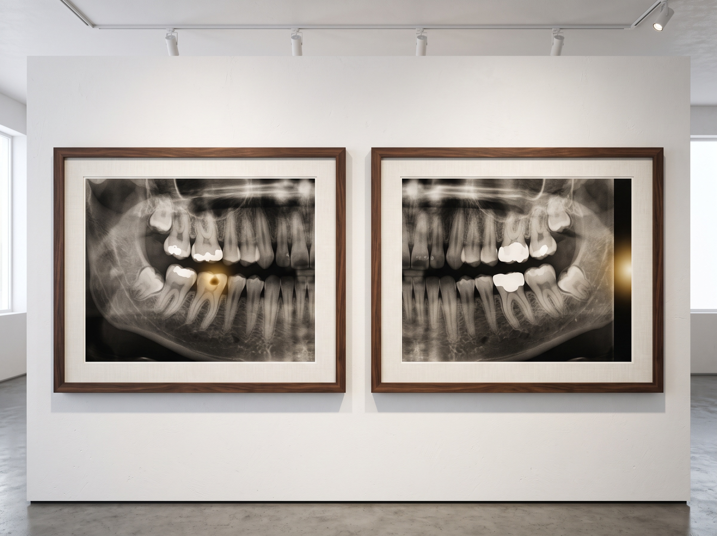
A model attends the way it was taught to attend, and what it was taught is the sum of the images and labels it trained on. A system drilled on thousands of carefully marked lesions will tend to light up on lesion-like texture; one trained on a narrow or biased set will carry those blind spots into every overlay it paints. The heatmap, in other words, is downstream of the dataset, and its honesty is bounded by the honesty of that corpus, a dependence we traced in the story of the public, pixel-labeled archive that becomes the raw material of imaging AI. When two commercial readers disagree about the same radiograph, their overlays are often the clearest evidence of why, each lighting a different region, each betraying a different training history, a contrast we drew out directly in comparing two AI readers of the dental radiograph and when each earns its place. The explanation, read carefully, is as much a portrait of the model’s upbringing as of the tooth in front of it.
Explanation as Verification, Not Absolution
The right posture toward these overlays is neither dismissal nor reverence. Regulators and professional bodies increasingly expect clinical AI to be interpretable, and a heatmap is a genuine step toward accountability, something far better than a verdict delivered from a sealed box. But interpretability is a tool for verification, not a grant of absolution. The overlay exists so a competent clinician can audit the machine, catch the obvious shortcut, notice the attention that landed nowhere sensible, and decide whether the finding deserves the weight the model assigned it. Used that way, the heatmap makes the human sharper. Mistaken for proof, it makes the human lazier, and a confident color over a radiograph is one of the easier things in this field to over-trust.
Future Developments
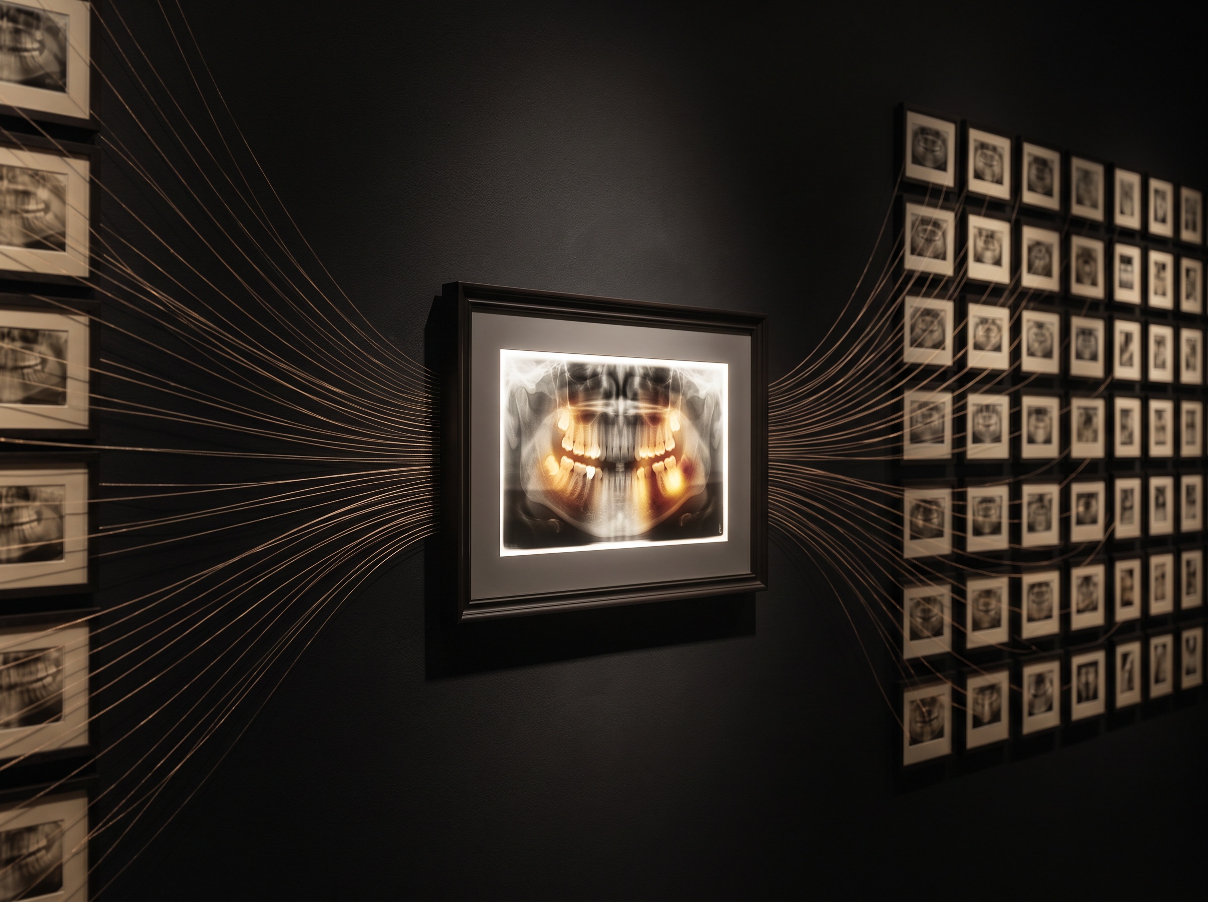
The overlays will get better, and they will get more honest about their own uncertainty. The near horizon holds explanations that move beyond a single hot blob toward something closer to reasoning made visible, counterfactual maps that show what would have had to be different for the verdict to flip, calibrated confidence rendered into the image itself, and attention that can be checked against the model’s stated rationale rather than merely admired. What will not change is the nature of the task. A heatmap is a picture the machine draws to justify itself, and pictures, in this gallery above all, are read and not simply believed. The most sophisticated explanation in the world still asks the same thing of the clinician that the first radiograph ever did: look again, look harder, and decide for yourself what the shadow means.
Sources & further reading:
No Comments